GoGO Squeez Boost
GoGo SqueeZ is traditionally marketed towards kids and their parents. Therefore, the design is whimsical and childlike. However, it has been found that kids are not the only ones who enjoy this tasty snack. Many athletes consume GoGo SqueeZ before heading to practice because it is a fast, healthy snack that they can easily grab when they are on the go. To cater towards athletes, a new visual identity has been given to GoGo SqueeZ... Introducing GoGo SqueeZ Boost!

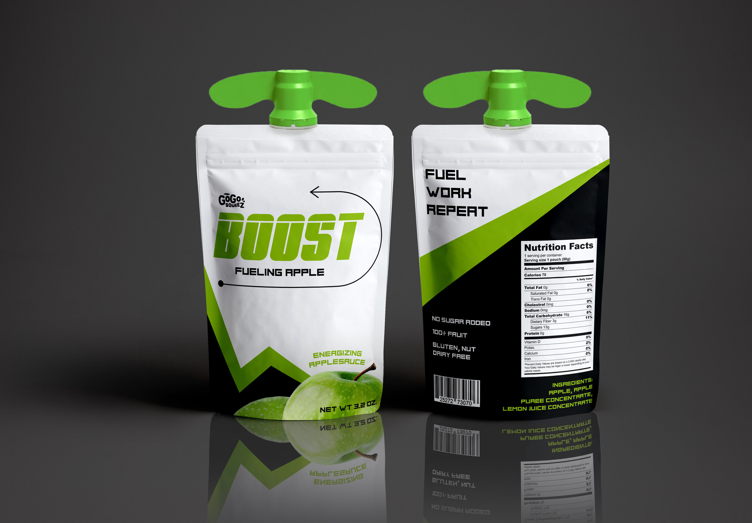
THE Product
I used a bold typeface, strong zig zag lines, and lines that mark different athletic plays to market the product towards athletes. The bold zig zag line carries one’s eye from the front, to the side, to the back. It also hints at the form of an apple. Since the green strip is thinner than the white, it resembles the skin of the apple, while the white is the center. The white, thin athletic play lines are always used to draw attention to different important elements. On the front, the line is used to showcase the triangle cutout which shows the product. The curved play line on the right side holds the restatement of the product name. Finally, the one on the back brings attention to the words, "Boost Your Game."


The Dielines
These dielines show what the product package would look like if it were to lay flat. The left dieline shows the design bleeding all the way to the print line, while the right dieline shows how it would be cut before folding.


Mood board
Multiple mood boards with different color schemes were created before I began designing the final product. I decided to move forward with the neon green, black, and white color scheme to match the color of green apples, the flavor of the pouches.

Product Sketches
Before going digital, I developed different sketches of the product. Each design was inspired by the mood board.
